MOSAIC
MOSAIC
STRATEGIC PLANNING + FULL REBRAND
MOSAIC (MCLA Open Shared Arts + Intersectional Culture) is the public outreach arts & culture program of MCLA (Massachussetts College of Liberal Arts) in North Adams, MA.
Formerly known as M.A.C. (MCLA Arts & Culture)prior to Spring of 2022 when the new Director of the program contracted me to assist with strategic planning and implementation of
Community Outreach
Marketing Structure
Rebranding | Messaging and Logo work
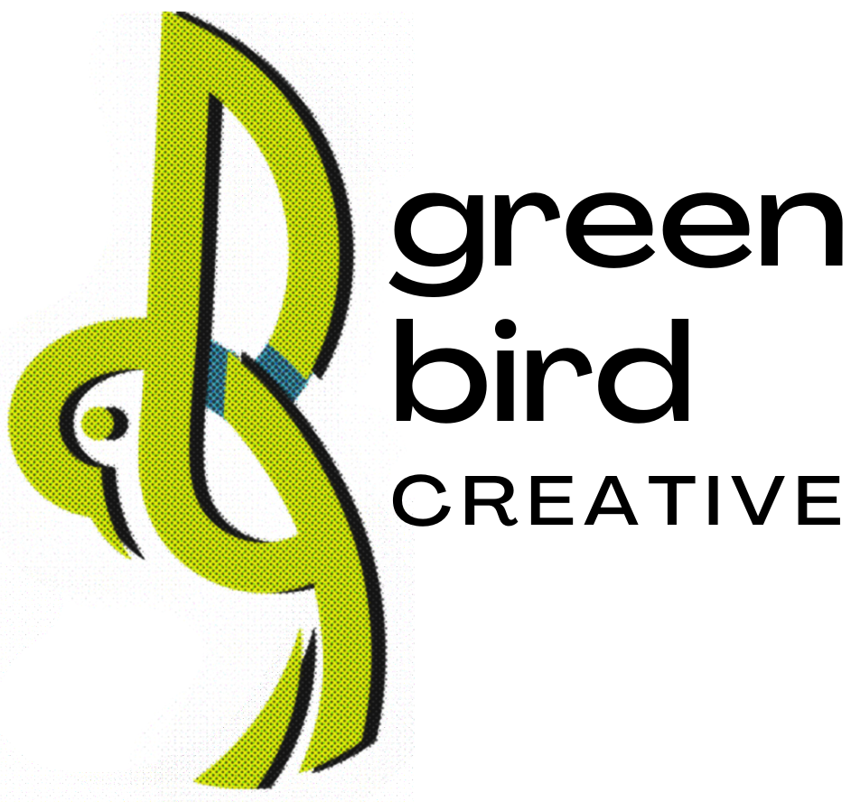
Original program title & branding

Green Bird Draft 3

VISUAL REBRANDING |
NAME + LOGO
COMMUNITY IMPACT ASSESSMENT FOR STRATEGIC PLANNING
To begin developing the pathways and suggested routes for the team at *MAC, I needed to understand the history of the program, where it came from, the culture of MCLA, and the desires of its immediate community which it was attempting to interact with.
I conducted a 1 month impact survey to gain an understanding of what the general knowledge and associative feelings were about *MAC.
I assessed the current functions of the program and measured against the needs for visibility and appropriate messaging for desired demographic growth.
I attended cooperative feedback sessions with faculty of MCLA to gain an understanding of staff desires for visibility and participation as well as identify blindspots in messaging and understanding between internal faculty at MCLA and the community which they were attempting to reach.

CONSIDERATIONS
-
In considering MCLA as the institution that holds MOSAIC, it was important to me that the name and logo identify and complement the mission of the program, MCLA’s colors and style, as well as indicate this was an institutional program with potential to become a true community pillar.
-
MCLA sits at the base of the taller peaks of the Berkshire Mountains in North Adams, MA. The mountains themselves, which notoriously become several shades of lavender and grey purple through the winter months, are a major geographic indicator for MCLA and the town of North Adams itself.
-
This logo needed to be distinct enough that it would be recognizable on several documents, types of signage, print assets, online, and even on merch and apparel. This lead me to zoom out and consider a very simple and recognizable shape that could be pinned immediately to the local organization without text or copy accompanying it.
-
MOSAIC (formerly MAC) has undergone a series of ownership, directors, and failed branding attempts. I wanted this logo to be solid enough to survive this, and set MOSAIC apart from MAC as its’ on initiative with a strong foundation and presence. I also wanted MCLA and MOSAIC to avoid needing to pay for and implement another rebrand due to a logo designed presently that leaned into fad or trend, which would significantly date it within a few years. This was the basis for strong, geographic shapes that never go out of style.
-
The name:
MOSAIC came about as a name (and acronym) that reflected the mission and values of the fresh program initiative-
MCLA (home) Open (to combat the “exclusivity” Academia projects) Shared (brought to the community) Arts (all forms) + Intersectional (reflective of the desired demographic) Culture (the negative space that binds all the pieces together.)
The Logo:
This image needed to reflect a combination of the Heritage, Geographic Location, Recognizability, Timelessness, and Reflection of the name and mission of MOSAIC.